
On this page
- Rule 1: Show it only when the real button is gone
- Rule 2: Keep it in sync with the selected variant
- Rule 3: Do not cover other fixed elements
- Rule 4: Respect the phone's own UI
- Rule 5: Do not let it cause layout shift
- Rule 6: Watch the rest of the page for side effects
- What to put inside the bar
- Shopify vs WooCommerce: how we build it
- How to know if it worked
- The bottom line
On a phone, your add-to-cart button is usually visible for about two thumb-swipes. After that, the shopper is reading reviews, zooming photos or checking sizes, and the one button that matters has scrolled off the top of the screen.
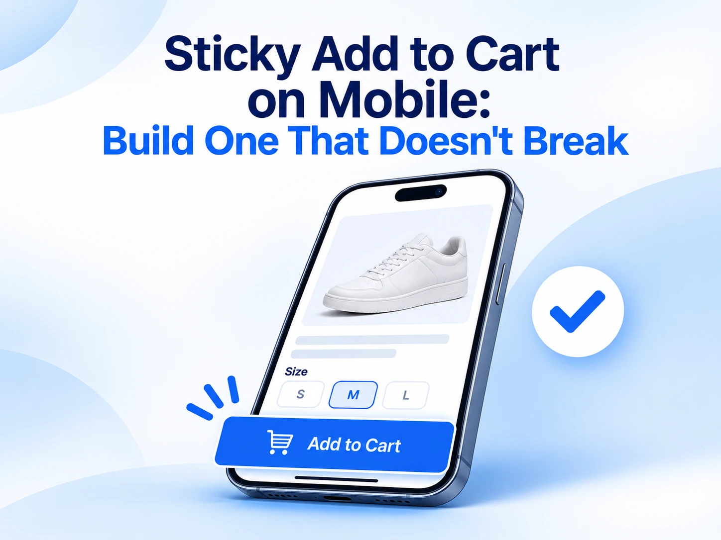
A sticky add-to-cart bar fixes that by keeping a buy button pinned to the bottom of the screen. It is one of the most requested product page changes we get on both Shopify and WooCommerce.
It is also one of the easiest to get wrong. We recently built one as part of a full product page redesign on a heavily customised Shopify theme, and most of the work was not the bar itself. It was making sure the bar did not break everything around it.
Here are the rules we follow.
Rule 1: Show it only when the real button is gone
A bar that sits on screen from the first pixel duplicates the button the shopper can already see and steals space from the product photo.
Use the browser's IntersectionObserver to watch the main add-to-cart button. When it leaves the viewport, slide the bar in. When it comes back, slide the bar out. It costs almost nothing in performance and needs no scroll listeners.
Rule 2: Keep it in sync with the selected variant
This is where most quick installs fail. The shopper picks size M in the main form, scrolls down, taps the sticky button and gets size S added, because the bar kept its own default.
The sticky button should never hold its own state. Either it submits the main product form directly, or it listens for variant change events and updates its price, availability and variant ID every time. If the selected variant is sold out, the sticky button must say so too.
On Shopify themes that means hooking into the theme's variant change event. On WooCommerce variable products it means listening for the found_variation and reset_data events the variation form fires.
Rule 3: Do not cover other fixed elements
The bottom of a mobile screen is crowded real estate. Cookie banners, chat bubbles, back-to-top buttons, "free shipping" bars and app install prompts all want it.
Before launch, open the page on a real phone with every app and banner switched on and check:
- Does the chat bubble sit on top of the button?
- Does the cookie banner hide the bar on first visit?
- Does the bar cover the last line of the footer or the checkout link?
Add bottom padding to the page equal to the bar's height so nothing important is permanently hidden behind it.
Rule 4: Respect the phone's own UI
iPhones with a home indicator need extra space at the bottom. Use CSS env(safe-area-inset-bottom) in the bar's padding so the button is not sitting under the swipe bar. Test in Safari, where the address bar collapses and expands as you scroll, and the viewport height changes with it.
Rule 5: Do not let it cause layout shift
If the bar pushes content up when it appears, the page jumps and your Cumulative Layout Shift score suffers. Position it as fixed so it overlays rather than reflows, and animate it with transform rather than changing height or bottom.
Rule 6: Watch the rest of the page for side effects
New fixed elements change how taps behave on a page. During the same redesign, the product image gallery had a tap problem: some taps on slides did nothing. The gallery used a looping slider that creates cloned copies of slides, and the click handlers had only been attached to the originals.
The fix was to use a delegated event listener on the gallery container instead of a listener on each slide, so cloned slides respond exactly like the originals. It is a small change, but it is the kind of thing that turns up once you start testing a product page properly on a phone.
The lesson: when you add a sticky bar, test every interactive element on the page again, not just the bar.
What to put inside the bar
Keep it tight. On a 375px-wide screen you have room for:
- A small product thumbnail (optional)
- Selected variant, such as "Black / M"
- Price
- The button
Skip quantity steppers and secondary buttons. If the shopper needs to change options, tapping the variant label can scroll them back to the main form.
Shopify vs WooCommerce: how we build it
Shopify: We build it as a theme section or snippet in Liquid, rendered only on product templates, with a small JavaScript module that reads from the main product form. Avoiding a separate app keeps the bar fast and means it inherits the theme's fonts and colours automatically.
WooCommerce: We add it through a lightweight custom plugin or the child theme, hooked into woocommerce_after_single_product, with the same observer and variation event logic. Simple products need far less code than variable ones.
On both platforms there are plugins and apps that do this. They are a fine starting point, but check rules 2 and 3 carefully before you trust one in production.
How to know if it worked
Measure add-to-cart rate on mobile product pages for two to four weeks before and after launch, keeping campaigns and pricing steady where you can. If you can A/B test, even better. Also watch for an increase in wrong-variant returns or support tickets, which is the sign that rule 2 was missed.
On the redesign behind this post, mobile add-to-cart rate went from 31% before to 76% after. That covers the whole redesign, not the sticky bar alone.
The bottom line
A sticky add-to-cart bar is simple in concept and fiddly in practice. Show it at the right moment, keep it in sync with the shopper's choices, keep it out of the way of everything else and retest the whole page.
Get those right and it becomes the button your mobile shoppers use most.
Bit Aura builds product pages on Shopify and WooCommerce with mobile conversion in mind. Talk to us about yours.
Related services
Need help with web design?
Tell us what you are planning and we will point you to the right next step. No pressure.